Destroying responsiveness
HTML is responsive by default; we destroy it with CSS (and stupidity)
Making web pages responsive is believed to be difficult, requiring skill and hard work to accomplish. Too many developers aren’t willing to make the effort, and so there remain poorly-coded websites everywhere you look.
Anyone who uses a smart phone to surf the Internet encounters such sites regularly (unless like most people you hate the public sphere and spend all your time on Big Tech sites such as Facebook or Instagram).
But the thing that most web developers have forgotten, if they ever knew it, is that HTML is responsive by design. It’s true: responsiveness is the default.
In short, and here is the takeaway: Most devs use CSS not to make their pages more responsive, but to destroy responsiveness.
They use CSS to blow responsiveness away, and then use a few media query hacks to try to get back some small elements of it. Kind of like packing your home to the ceilings with fossilized shit, and then hacking out tunnels to the bathroom, the kitchen, and the TV. You can do it, but why?
To make such a site accessible and more usable as well involves nothing more than using elements semantically and correctly, and following a few simple rules, such as adding a “skip link”.
So let’s take a look at a simple web page with header, footer, and “side” navigation done in a semantically correct way. To save space, I’ll only include the <body> element.
<body>
<header>
<h1>I be responsive by default</h1>
<a href="#main">Skip to main content</a>
</header>
<nav aria-labelledby="main-navigation-label">
<h2 id="main-navigation-label">Main navigation</h2>
<ul>
<li>
<a href="/about">About us</a>
</li>
<li>
<a href="/contact-us">Contact us</a>
</li>
<li>
<a href="/terms-of-use">Terms of use</a>
</li>
</ul>
</nav>
<main id="main">
<article>
<header>
<h2>Some fake Latin for you</h2>
</header>
<!-- five paragraphs of lorem ipsum text -->
</article>
</main>
<footer>
<p>© 2023 by Smart Devs.</p>
</footer>
</body>Obviously, this is a very simple web page, but it will do for our uses here. Note that there is no CSS, no JS. Just HTML. Note also that this is pretty readable even without the syntax highlighting. Nice.
OK, fine, if you don’t trust me, here is the <head> element:
<head>
  <meta charset="UTF-8">
  <meta name="viewport" content="width=device-width, initial-scale=1">
  <meta
    name="description"
    content="This here page is responsive by default! Wee hoo!">
  <title>Responsive design</title>
</head>
Now you can wrap that up in an <html> element (don’t forget the lang attribute and the document type declaration: <!DOCTYPE html>) and try it yourself.
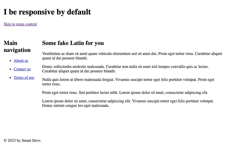
So what does this look like on a desktop? Well, it is butt ugly, but it is completely readable, usable, and navigable, including by keyboard:
How does this score in Lighthouse? Oh, look! Four 100s — a perfect score!
Damn. That was easy. What about even stricter accessibility? The above is only AA. Can we do AAA? Let’s use Deque’s axe DevTools Pro to check:
Uh, oh. What’s gone wrong here? Well, they explain:
So the navigation links are too tightly spaced. Well we can easily fix that… with CSS. But we’re not there yet, so maybe just wrap the anchor elements with paragraph elements and use the default stylesheet to get that spacing:
      <li>
        <p>
          <a href="/about">About us</a>
        </p>
      </li>
      <li>
        <p>
          <a href="/contact-us">Contact us</a>
        </p>
      </li>
      <li>
        <p>
          <a href="/terms-of-use">Terms of use</a>
        </p>
      </li>
Now our page looks like this:
Still butt ugly, but still very usable. As for AAA accessibility, let’s check:
Oh, look! Our page is AAA accessible and super performant (if Lighthouse can be trusted). And is it responsive? Well, here’s what it would look like on my partner’s iPhone Mini:
Wow! It is completely responsive! And accessible. Fat-fingered folks like me can easily hit the right link. But is it standards compliant? Well, I ran it through the somewhat-sketchy W3C Markup Validation Service and there were zero errors or warnings. I was hoping for a better score, but it turns out it’s impossible.
Of course, our frail egos will never let us leave it like this. We need to use CSS to make it purdy. And here is where we fuck it up completely. Almost every time.
We know we should start with mobile — mobile first, right? But of course we won’t. We’ll deal with that “later”.
OK, we want side navigation. We can use the newfangled grid to get exactly what we want. Let’s jump right in and use a grid to get the layout we want:
<style media="screen">
  body {
    margin: 0;
    padding: 0;
    display: grid;
    grid-template-areas:
      "header header"
      "nav main"
      "footer footer";
    grid-template-columns: min-content auto;
    grid-template-rows: min-content 1fr min-content;
    min-height: 100vh;
  }

  body > header {
    grid-area: header;
    padding: 1rem;
  }

  body > nav {
    grid-area: nav;
    padding: 1rem;
  }

  body > nav a {
    white-space: nowrap;
  }

  main {
    grid-area: main;
    padding: 1rem;
  }

  body > footer {
    grid-area: footer;
    padding: 1rem;
  }
</style>
Nothing fancy. Just a bare minimum grid layout. Here’s how this looks on the desktop:
Not too terrible. But what about that iPhone Mini?
Well, it is still usable, but there’s a lot of wasted space. And what if we then add a right-hand sidebar as well? That’s just not going to work unless we want our users to have to turn their phones to landscape orientation just to use our website.
Just for fun, as one final insight, let’s take a look at it in the Lynx text-only browser (no CSS, no JS, not even any images):
Who uses Lynx? Probably no one. But it’s nice to know that the page is usable even in Lynx (and this often gives insight into how a screen-reader or self-voicing browser will read the page).
Hmm. But not all browsers that support CSS support grids. Won’t this be a mess on those?
Responsiveness as the default to the rescue! We can simply wrap our modern CSS so that it only gets applied if it is supported. Then very old browsers will simply get the no-CSS page:
@supports (display: grid) {
  /* grid CSS here */
}
(Or we can start simply with CSS that works on any CSS browser, even IE3 — although how do you test that? — and use @supports to enhance the CSS experience as more modern CSS becomes available. Maybe that’s another post.)
Note: I use VoiceOver on Mac for testing, and have Windows 11 installed in Parallels so I can run tools such as the NVDA screen reader. If you aren’t doing something like this, trust me, you don’t have a damn clue how your site presents to people using similar accessibility tools.
I could easily go on, but I suspect that most readers have gotten the point. And the more CSS we add to make things a bit cooler on the desktop, the more likely we are to make the site unresponsive, if not inaccessible and unusable by many.
The first resort of most devs would be to a media query and a set point. But that’s a very coarse way to approach responsiveness. It might look OK on most phones and the typical laptop, but remember that most people on a desktop don’t maximize their windows, so the browser window could be almost any size and/or aspect ratio.
Using only set points, even if we add several, the page tends to be a mess at anything other than those set point widths (or heights). Choosing set points based on screen resolutions (you’ll need dozens!) is what we call the “stupid approach to responsiveness” and is one reason that so many devs just give up and settle for “OK at some small set of viewport dimensions”.
Better to make the page flow such that it adjusts to any viewport.
We’ll have to keep that for a future polemic. Today, I just wanted to make clear that the essential web was responsive from day one, and as far as HTML is concerned, it remains so.
While CSS can be used to provide a slicker user experience, which is nice, in the hands of a mediocre dev the first thing it accomplishes usually is to destroy responsiveness, if not usability and accessibility as well.
All the more reason to build your websites first as plain HTML. Check for standards compliance. Check for accessibility. Check for responsiveness. Check for optimization (do you have all the right elements in the <head>?). Linked Data anyone?
Then add CSS slowly, piece by piece, checking all of the above as you go along and dealing with issues as they arise, not putting them off until the code is awash with them. And then, and only then, adding JavaScript behaviors only where truly needed, while making sure that the page loads and works properly even without the JavaScript.
This takes some practice, but once you learn it, it’s easy. If you taught yourself TDD or BDD or similar habits, then you can teach yourself to build your page correctly: mobile-first and with gradual enhancement, rather than starting with all the bells and whistles and then trying to work around the problems.
If you’re a big fan of front-end frameworks such as React, Vue, Svelte, SolidJS, etc., then I suggest that you try building your application first in plain HTML, then adding plain CSS, and finally as little plain JS as you can get away with. And then adding components via your framework only as necessary.
You may discover that you’re not really a very good front-end dev. Just a React/whatever dev.
Astro makes using bits of these frameworks easy with its islands architecture (as do a few other modern frameworks… maybe). I use Astro for it’s component architecture and ease of use with TypeScript, but I never use the islands feature. I don’t need component libraries. They’re nothing more than unnecessary bandwidth and complexity. I’m fine without them.
Finally, take a hint from William of Ockham and do not needlessly multiply entities. If it isn’t necessary — if it isn’t contributing to the usefulness of the site — then get rid of it. As Sir Arthur Quiller-Couch admonished us long ago:
Murder your darlings.
It’s as applicable to web development and design as it always has been to literature.


