
MUI is an atrocity
And don't get me started on Tailwind

I remember many years ago when Google first announced their new design language, Material Design. Frankly, I was blown away by both the beauty of the design and the profound thinking that had gone into it. I was disappointed to discover that it was for Android phones. I wanted to use it on the Web right away.
And I wasn’t alone. Almost immediately there were competing efforts to build Material Design component libraries for the Web. After a few years of struggle, one emerged as the clear winner: Material UI. Later, in a surprising admission, this was shortened to MUI. And what an atrocity it is!
Hooray for category errors!
Way, way back, before most of us were born, when the World Wide Web was still wet behind the ears, I fought bravely in an early flame war. The battle was over design for the Web.
Arrayed on one side were the graphic designers coming from design for static media, such as billboards, magazines, newspapers, and the like. On the other side were those of us who recognized that the Web was a new medium and that it needed new rules.
A key early figure on the GD side was David Siegel. Siegel was—if I remember correctly—the inventor of the “single-pixel GIF” which was a 1x1 pixel transparent GIF image that could be stretched to any size in order to push things around on the page. It was used for layout.
Siegel was a fan of tables for layout, text in images, and more, and he never met a standard that he couldn’t ignore or subvert.
My favorite atrocity of his was described in his book, Creating Killer Websites, where he recommended “entry and exit tunnels”. This is where you force your user to go through a series of pointless splash screens to get to your site, and then… wait for it… another series to get away from your horrible site.
Wow. Let’s just say the book was aptly named.
The primary mistake that Siegel made in those days (and made and made and made) was in thinking that the dynamic medium of the Web was just a newer version of paper. So he expected dictatorial control over layout, color, etc.
“Pixel-perfect” they called it.
Way back in 2002, as I recall, I wrote a long diatribe on some list about how utterly stupid this approach was. Oh, dear me. It is still out there. The Web really is forever.
In it I explained that the idea of a designer having tight control over the user’s experience of their design was easily revealed to be stupidity of the first order. Furthermore, it was shockingly authoritarian: you will view this material the way I intend it and no other way.
Bwah ha ha and all that.
People do whatever the hell they want
The truth is that humans do whatever the hell they want and rationalize it after the fact. You can do everything in your power to control them, but they will subvert your efforts every time.
I recommended then—and I stand by this recommendation still today—that we treat design for the Web as a cooperative effort between designer and user. Give the user a say in it.
In short, it shouldn’t matter what size, resolution, or aspect ratio the user’s viewport is set to, your site should look good and be accessible and usable. For years I’ve been trying to find the time to build an app that will re-render the page based on a set of simple rules—I call it “rule-based layout”—as the viewport, font-size, etc. changes.
One simple example is reflowing columns. As I stretch my browser window from 1000px wide to 3400px wide, why do I just get a lot more white space? Why not add more columns and reflow the text?
Or why not add more content, or remove content (replacing it with a link) when the page width increases or decreases, respectively?
But I digress.
The problem with MUI
Initially, I was quick to embrace the new material design component libraries. But a problem soon became evident, if not inescapable: Material Design was never intended for a Web page. It was for phones.
The widgets that looked so good on a phone screen seemed out of place on a bigger screen. I fought this truth for some time, but eventually I had to admit to myself that using Material Design on a Web page was a category error. A Web page is not an Android app, and no amount of wishing would make it so.
If I haven’t made it clear enough, let me say it bluntly:
MUI was a terrible idea right from the start. It never should have been attempted, and should have been abandoned long ago.
I am a slow learner, I guess
Despite this recognition, the hype around Material UI was ubiquitous. It seemed as though everyone was using it. What was I missing?
And if you went to their website and read the advertising copy, well, it sure looked like a grand idea.
So more than once—sad, but true—I added Material UI to a project. It just looked so easy. Who doesn’t like a free lunch?
I should’ve listened to Heinlein: there ain’t no such thing as a free lunch.
In every instance, I ended up ripping MUI out and writing my own components from scratch. Every. Single. Time.
The problem is abstraction. MUI wasn’t satisfied to just be Material Design for the Web—already a stupid idea as I explained above. Oh, no. It also had to be everything to everyone.
That meant abstracting the hell out of it. So developers who wanted to use “Material Design” could use it without it looking like Material Design. If you’re thinking, well, that defeats the entire purpose of the library, give yourself ten points. You’re smarter than you look.
Why on Earth would you want to make it so that your library that implements a very specific and well thought out design language (albeit for a very different medium) allows devs to override essentially every single key feature of that language?
Abstraction is not your friend
Abstraction makes code more powerful, but at the expense of making it more complex and ungainly. I have news for you: one size absolutely does not fit all.
To abstract the code enough to make Material Design into Anti-material Design required lots and lots of div wrappers. And then rather than simply supplying the CSS and letting the developer modify it, MUI provided a complex and awkward API so that devs could “theme” it. That is, make it not Material Design.
Oh, yes! There is an entire “theme” infrastructure that is an enormous pain in the ass to use. Did I miss something? Isn’t this what CSS is for? Why do we need a theming widget and all these configuration files and APIs?
Not long ago I had to work on a code base where some of the key devs lacked humility. That is to say, they were sure they knew what they were doing, and there was no convincing them otherwise.
They never saw a library they didn’t like. An app that needed at most half a dozen dependencies had more than eighty. Insanity. It was years out of date because no one wanted to update all those dependencies. Attempts had failed miserably. Talk about tech debt! This was tech bankruptcy.
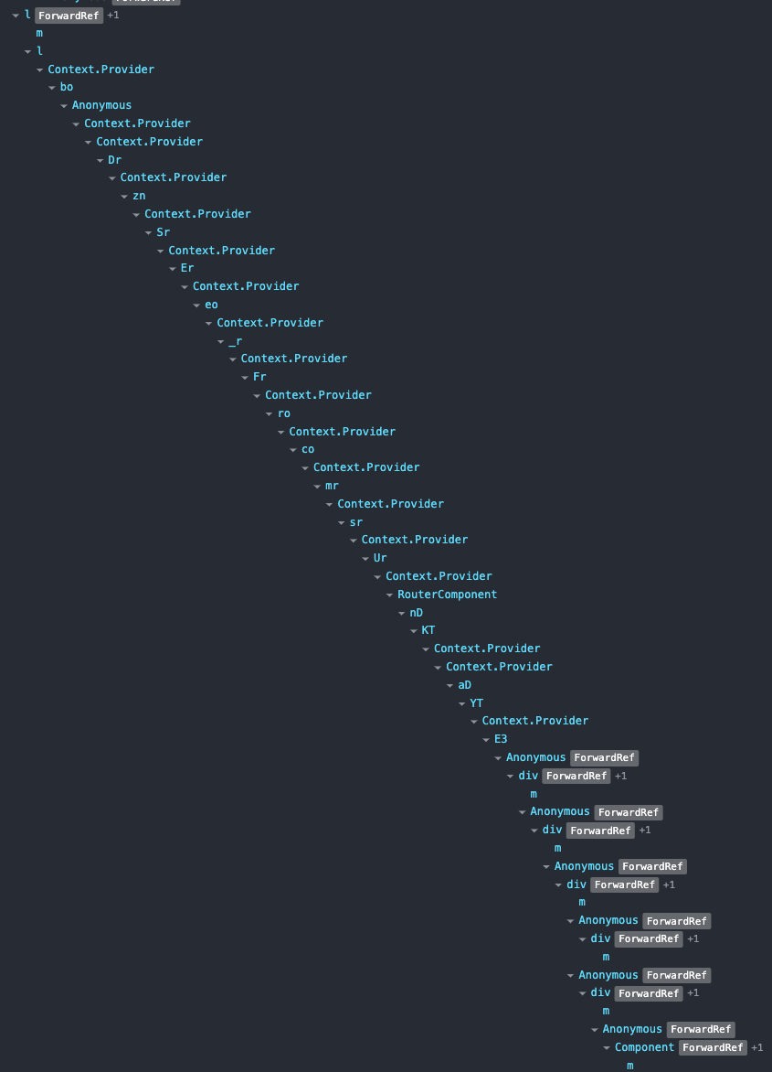
I was tasked with implementing a “data grid”—a widget that, IMO, is almost never worth the trouble. As everything was MUI, I turned to the MUI data grid. I managed, after much hair pulling and gnashing of teeth, to jam it into the page and get it “themed”.
Then I went to look at the React DevTools and… what the hell? The data grid component appeared to consist of elements with names such as <g> and <l> and so on, nested dozens of layers deep. In short, an utterly unreadable mess.
And it was so heavy. There were all these features, all this code, all this CSS that I did not need or want. An enormous API just for a damn table.
Finally, when no one was looking, I ripped it out and just used an HTML table. I styled it myself, made the columns sortable, and, IIRC, you could hide them, too. That took me maybe a day? It looked identical (no one noticed), but under the covers it was simple, fast, and easy to understand. Oh, and semantic and far more accessible. Hell, it actually used a table element! Who knew?
And when I went to look at my table in React DevTools it was so simple. Recognizable elements—and semantically correct, too—such as <table>, <tbody>, <tr>, <th>, and <td>. Nested at most half a dozen layers deep. I could see the whole thing on the screen without scrolling horizontally.
The data grid is probably worst case, but all the other MUI components were similar. In order to make them do anything, they were abstracted until they mostly lost their semantics, and all involved extra, pointless elements there simply so one could apply styling to them.
The example above is actually not a data grid (the data grid is much more complex), but from a very simple demo page featuring only a sign up form. Think the HTML is probably cleaner? Think again:
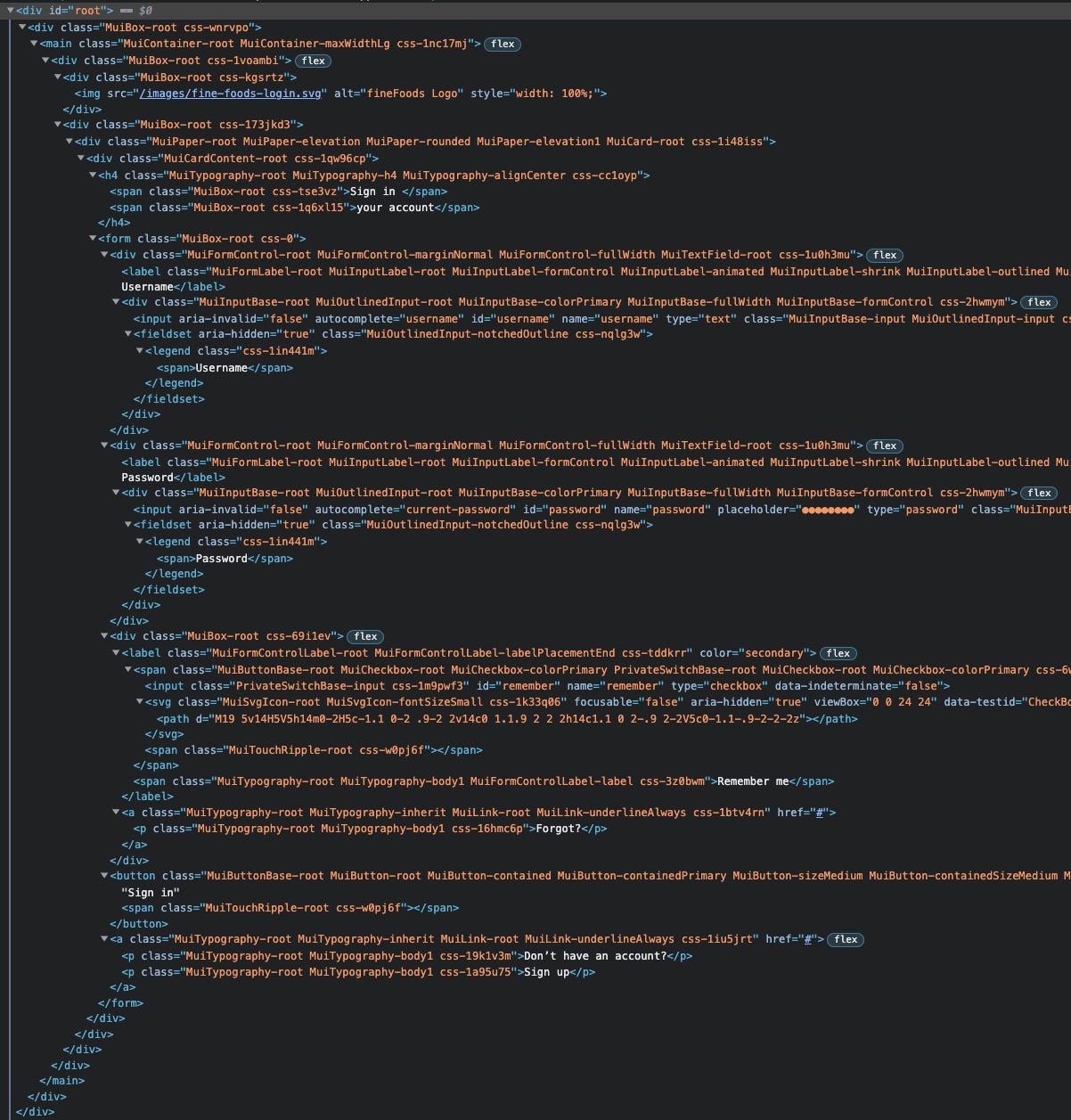
All that mess, to make this:

MUI has become so incredibly bloated and complex that it would be fair to describe the people who use it as “MUI developers” rather than front-end developers. They may be expert at configuring MUI, but I would question whether they actually had time to learn anything at all about HTML and CSS, which is, um, what the Web is made of.
In truth, it is clear now that the intent of MUI is to replace HTML and CSS and become the lingua franca of the Web. Ugh. Didn’t Polymer already try that?
Homie don’t MUI
I am sure that the MUI folks are nice people. And they probably mean well. And now, of course, there is the sunk cost fallacy to consider, right? They’ve invested so much time and effort, and they have so many users, and there’s all that legacy code. Too late to do it right now!
But then as I pointed out, it was a mistake from the word go. We should have followed the same design process that Google did, but for dynamically-sized Web pages in browsers, then created the correct design language for that medium.
But component libraries are generally a bad idea anyway. At least in enterprise. Every enterprise has specific needs. For any component library to meet the needs of widely varying projects, it has to be abstracted all out the wazoo. And that makes for waste.
It is much smarter, if you’re in enterprise, to create a dream team of designers, UX engineers, developers, etc.—people who truly understand the medium—and build a bespoke, reusable component library specifically for your applications. No wasted anything. A perfect, tailored fit.
And, as a very bright young developer once said to me, never write a line of code until you have to. Don’t make components you don’t need or use. Don’t add capabilities until you are absolutely sure that you need them. Keep it lean and mean.
Better still, have your team create an HTML pattern library and the CSS (and maybe some JS) to go with it. Then your devs can implement those patterns precisely in whatever library they prefer, from vanilla HTML/CSS/JS (hey, done already!) to SolidJS or Astro or Qwik or even that ancient and decrepit old fart, React.
Fools will say, well, that’s not DRY. But of course it is. You can reuse those components everywhere in your multiple apps. And they will be completely consistent with each other and your design system because you designed them that way. DRY doesn’t mean using a shitload of OPC—other people’s code.
And you won’t be trusting some folks you don’t know, don’t employ, and can’t depend on to keep the code working and secure. Your people will know exactly how the code works because they built it. And the buck stops there.
Web widgets are just not that complicated! There are a few patterns, generally well understood, that are applied over and over again. There are plenty of good guides out there. Just hire some people who actually know what they’re doing and put them to work.
As for MUI, I have reached the point in my career where I can afford to say no to work that doesn’t interest me. And so I am saying no to MUI. Just no. And frankly, I’m not too keen on any of the other component libraries either.
Browsers, HTML, CSS, and JavaScript/TypeScript have matured greatly in the past decade. We should be aiming for simplicity, and running closer to the metal, not adding layer upon layer of useless complexity, which only aggravates the cognitive footprint for no ROI.