
A bit more about responsiveness
Doing it the Craft Code way

Don’t worry good readers! I will get back to bitching about things in my next post. Must maintain my cantankerousness! I’ve got a good one in the bullpen warming up.
But I thought that it would be a pity to leave that last post — Destroying responsiveness — without providing a little more detail about doing it well. But not too much detail. This isn’t my “teaching” blog. It’s my bitching blog.
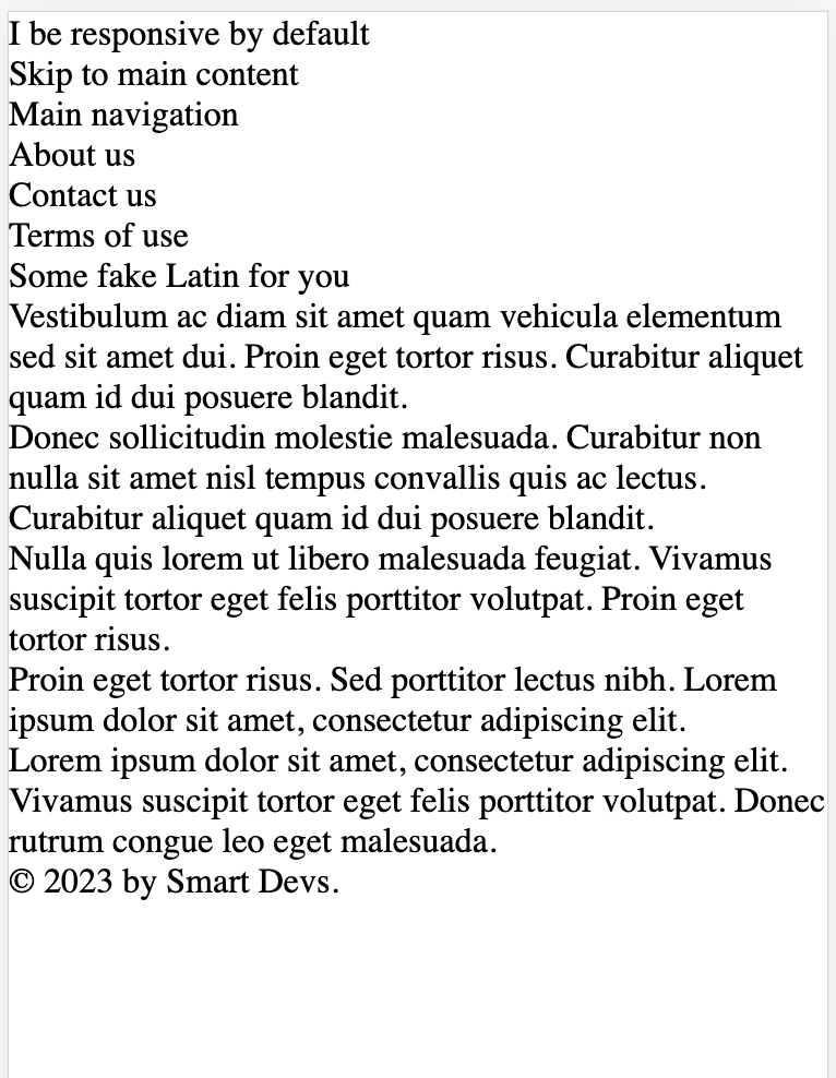
Let’s drop the previous CSS and get back to the plain HTML of the last post:
<!DOCTYPE html>
<html lang="en-US">
<head>
<meta charset="UTF-8">
<meta name="viewport" content="width=device-width, initial-scale=1">
<meta
name="description"
content="This here page is responsive by default! Wee hoo!"
>
<title>Responsive design</title>
<style media="screen"></style>
</head>
<body>
<header>
<h1>I be responsive by default</h1>
<a href="#main">Skip to main content</a>
</header>
<nav aria-labelledby="main-navigation-label">
<h2 id="main-navigation-label">Main navigation</h2>
<ul>
<li>
<p>
<a href="/about">About us</a>
</p>
</li>
<li>
<p>
<a href="/contact-us">Contact us</a>
</p>
</li>
<li>
<p>
<a href="/terms-of-use">Terms of use</a>
</p>
</li>
</ul>
</nav>
<main id="main">
<article>
<header>
<h2>Some fake Latin for you</h2>
</header>
<!-- five paragraphs of lorem ipsum text -->
</article>
</main>
<footer>
<p>© 2023 by Smart Devs.</p>
</footer>
</body>
</html>And here’s what that looks like on my laptop:

And on my partner’s iPhone Mini:

As you can see, the HTML is responsive by default. At this point, your typical dev uses CSS to fuck it all up completely. Yes: we use CSS to destroy responsiveness, not to create it.
It’s a bit like cutting off someone’s arm and then sewing three fingers onto the stump and calling it a day.
What we want here is a layout that puts the navigation in a left-hand sidebar. On the left is the proper place for it, according to UX experts, although this one is short enough to make it a top nav bar. But we’re not the design team.
But on a small screen like that of the iPhone, we want the navigation above and the main content to fill the width of the screen.
A couple more requirements:
We want the skip link to appear only when tabbed to (but also available to VoiceOver and other screen readers).
We want the footer to sit at the bottom of the page, but not fixed there. If the content is long enough, then it can be pushed below the “fold”.
We’re OK with the header scrolling off the screen.
So let’s start, but we’ll start with mobile: everything in a single column.
The easiest way is to do this is with grid, as we did last post.
It will probably be easier if we start with a very minimal “reset” stylesheet. There is some controversy over this, but I think a minimal one is good for ironing out any remaining differences between browsers.
I’m going to try out this CSS reset from Elad Shechter. But there are many others. An old favorite is Andy Bell’s CSS reset. One thing that Shechter’s reset lacks, which makes me a bit wary of it, is Bell’s prefers-reduced-motion media query, which is important for accessibility. But for today, we’ll give Elad his chance.
If you’re following along, you might copy and paste the reset into the head of the page (we’re keeping things simple here). I put it in a separate <style> element so I can close it up and hide it. With that in place, here’s our new iPhone view:
Ack! We’ve ruined everything! But don’t worry, we’re gonna put it all back — only better.
Let’s start with the grid. We’ll also give the main regions a bit of padding and some temporary background colors so we can see what we’re doing. Here’s our CSS:
body > header {
  background-color: aliceblue;
  padding: 1rem;
}

body > nav {
  background-color: azure;
  padding: 1rem;
}

main {
  background-color: beige;
  padding: 1rem;
}

body > footer {
  background-color: blanchedalmond;
  padding: 1rem;
}

@supports (display: grid) {
  body {
    display: grid;
    grid-template-areas:
      "header"
      "nav"
      "main"
      "footer";
    grid-template-columns: 1fr;
    grid-template-rows: min-content min-content 1fr min-content;
    min-height: 100vh;
  }

  body > header {
    grid-area: header;
  }

  body > nav {
    grid-area: nav;
  }

  main {
    grid-area: main;
  }

  body > footer {
    grid-area: footer;
  }
}
So what does that look like? How about this:

Well… it’s a start. So let’s do the header first.
Our fonts are kind of ugly, so let’s use Modern Font Stacks to set the body font to a nice Transitional face (weight: 500) and the headings to an exciting Neo-Grotesque (weight: 400). Fast, nice, no layout shift.
We can also deal with the skip link, which we really only want visible when it is focused. Let’s give it a CSS class to make it easy to grab:
<a class="skip-link" href="#main">Skip to main content</a>There are a hundred ways to do this (slight exaggeration). I prefer simple. Absolute positioning has been around forever — I built my first professional website with it in 1997! Obviously, I will be dead soon. So, we’ll absolutely position it way off-screen (which will keep it available to tabbing but remove it from the DOM so it doesn’t take up space), then on focus we’ll bring it back and add an outline.
Here’s what I’ve added:
body {
  font-family:
    Charter, 'Bitstream Charter', 'Sitka Text', Cambria, serif;
  font-weight: 500;
  position: relative; /* To make the absolute positioning work */
}

.skip-link {
  position: absolute; /* Relative to the <body> */
  top: -10000px;      /* Way above the page */
}

.skip-link:focus {
  border-radius: 7px;
  outline-offset: 0.2rem;
  outline: 2px solid blue;
  position: relative;
  top: unset;
}
So far we only have level 1 and 2 headings. No need to add CSS for things we don’t use! Note: we can also pull out anything not used from the reset stylesheet, such as menu, table, meter, placeholder, etc. We can also use Type Scale to set our headings to a Major Third scale. We won’t need anything below h3, so we’ll choose font size accordingly:
h1, h2 {
  font-family: Inter, Roboto, 'Helvetica Neue', 'Arial Nova',
    'Nimbus Sans', Arial, sans-serif;
  font-weight: 400;
}

h1 {
  font-size: 1.953rem;
}

h2 {
  font-size: 1.563rem;
}
Now let’s add flex to our header:
@supports (display: flex) {
  body > header {
    align-items: center;
    display: flex;
    flex-basis: min-content;
    gap: 1rem;
    justify-content: space-between;
  }
}
I am assuming that the reader already knows how flex works. Here is the header now (on a laptop):

And here it is when we tab to the skip link:

(Note: we’re not going for beauty here. I’m not a designer. I’m just showing how we can gradually enhance a web page without losing the native responsiveness.)
Next: our navigation. The “main navigation” heading is really only for screen readers. Sighted users can see that it’s a navigation bar for the site at a glance. So we can move that off screen, too. We’ll start by giving it an off-screen class:
<h2 class="off-screen" id="main-navigation-label">Main navigation</h2>Now we’ll add a class to move that off screen, too. The absolute positioning trick is backwards compatible and easy, so we’ll stick with that. Maybe there’s a drawback I’m missing (let me know), but I’ve never found one. Put this at the top of your stylesheet:
.off-screen {
  position:absolute;
  top: -10000px;
}
And poof! The bothersome nav header is gone, but still available in the HTML outline:

And no accessibility issues.
The side nav is pretty close to good the way it is. We just want to add some padding and make sure that the anchor elements provide enough of a touch target: at least 24px high and 24px away from its neighbor.
But on a small screen, it’s taking up too much vertical space. Maybe later we’ll hide it behind a hamburger menu (although that’s not the greatest UX and might involve JS… we’ll see). For now, let’s flex it and make sure the links have sufficient touch targets and spacing:
body > nav a {
  display: inline-block;
  font-family: Inter, Roboto, "Helvetica Neue", "Arial Nova",
    "Nimbus Sans", Arial, sans-serif;
  margin-bottom: 24px;
  min-height: 24px;
}

/* And down in the @supports block at the bottom... */
@supports (display: flex) {
  /* ... */

  body > nav ul {
    display: flex;
    flex-wrap: wrap;
    gap: 2rem;
  }

  body > nav a {
    margin-bottom: 0;
  }
}
Now our heading and nav bar look like this:

If we add more links, they’ll wrap. We can live with that for now. As a now-famous friend once said to me: “Never write a line of code until you have to!” Heh, heh. We’re doing just-in-time craft coding here.
We’re pretty much done here. Let’s use our sans-serif font in the footer. And we’ll indent our paragraphs and add just a bit of leading below our h2 heading:
main h2 {
  margin-bottom: 1rem;
}

main > article p:not(:first-of-type) {
  text-indent: 1.5rem;
}

body > footer {
  background-color: blanchedalmond;
  font-family: Inter, Roboto, "Helvetica Neue", "Arial Nova",
    "Nimbus Sans", Arial, sans-serif;
  padding: 1rem;
}
Now we have this:
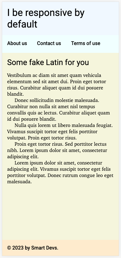
Butt ugly, but fixing that is someone else’s job. It works. What happens on browsers that don’t support grid or flex? We can check by simply commenting out those @supports blocks in our CSS and reloading the page:

Well, I can’t speak for you, dear reader, but I can live with it. Let’s move on to larger viewports.
Now the easiest way to handle this is with a media query based on the width of the viewport. We don’t want to switch to a sidebar nav until we have enough room for a decent column for the main content. We can use the width on the phone as a guide.
Chrome DevTools tells me those paragraphs (on the iPhone Mini) are roughly 24rem wide. The longest link is just under 6rem and we need 4rem to allow for padding. My ancient brain thinks that adds to 34rem. Let’s start with that.
Note: I don’t give a damn about screen resolutions. I’m not trying to work with this phone or that tablet or worried about whether we’re in portrait or landscape. For a simple layout like this, all I care about is do we have enough width at the current font size to fit a sidebar comfortably.
Here we go:
@supports (display: grid) {
  /* ... */

  @media (min-width: 34rem) {
    body {
      grid-template-areas:
        "header header"
        "nav main"
        "footer footer";
      grid-template-columns: min-content 1fr;
      grid-template-rows: min-content 1fr min-content;
    }
  }
}

@supports (display: flex) {
  /* ... */

  @media (min-width: 34rem) {
    body > nav ul {
      flex-direction: wrap;
      gap: 24px;
    }
  }
}
Now, at 34rem wide, we get this:

Obviously, it needs some work, but the basic layout is correct, it passes AAA accessibility, Lighthouse gives it four 100s — a perfect score — its HTML outline is correct, it works with keyboard navigation and screen readers. In short, it’s fine.
Squeeze the viewport just one pixel narrower, and you get this:

This also meets all the above criteria. And we can go from there.
What if the user has their font size set to very large? We’re using a min-width of 34rem, so the above, with the default font size of 16px, switched to the sidebar at a viewport width of 544px (16 × 34).
Now with the default font size set to 24px, our layout won’t shift to a sidebar until our viewport is 816px wide (24 × 34).
Here’s what it looks like with very large font at 816px wide:

And here it is at 815px:

And finally, on my partner’s iPhone Mini:
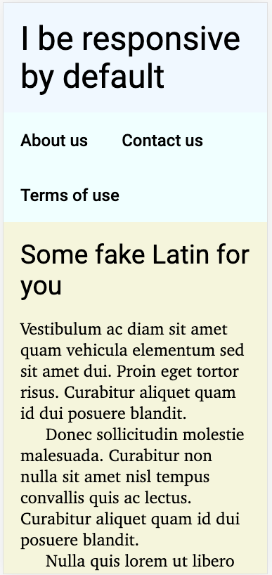
Still usable! Notice how the links wrapped nicely. I can live with that.
And all so easy when you do it right.
Note: this is not a teaching post, so my apologies if I assumed to much. This post is a mild polemic making the argument that HTML is already responsive: it is we who fuck it up with CSS. To that end, the above code is my argument to prove the point.
I am working on a teaching site called ScratchCode. I’ll post here when it’s up and ready.