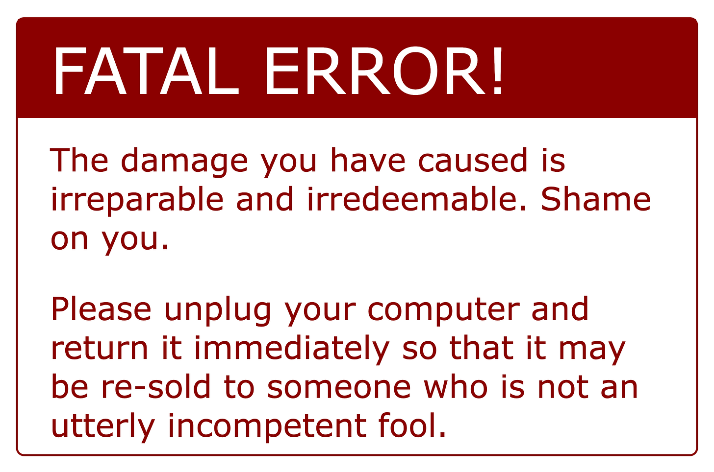
Stop scolding your users
Your users are not wrong: you are
For many years now I’ve been advocating strongly for an approach to error handling in user interfaces with little success. Here and there I win a convert, but most in the industry either scoff or yawn and turn away. I guess that tells you something.
My suggestion is this: stop scolding users.
Example: a user is filling out a form. She enters her email address but makes a mistake. It is not a valid email address.
When she tabs out of the email input (or, worse, when she attempts to submit the form), a big red box appears with a message something like this:
Error! Your email address is invalid. Please try again.
In short: You bozo! Can’t you even get your own email address right?
My view is simple. The bozo here is the developer/designer who created the form, not the user. Users make mistakes. Forms should make it as easy as possible for users to avoid “mistakes”.
Forms are often difficult to understand. Guessing the intent of the form’s designer is not always easy. I have filled out dozens—perhaps hundreds—of forms in which I’ve been stymied by the form. Often, I’ve simply given up.
It is rarely the case that I have no idea what the form expects; rather, it is that I can think of too many possibilities for what it wants, and I can’t tell which one is correct. That’s the mark of a poorly designed form, and they are myriad.
And it is so easy to avoid this. Here is how I approach it:
Every form input should know precisely what valid input looks like. Ideally, we’d have a type system that made very precise runtime static type checking possible. One alternative is the HTML Input element’s pattern attribute.
Every form input should make this information abundantly clear to the user both before and as the user enters data as both help text and, if possible, an example (but not as a placeholder—leave the input for input).
Form fields should indicate clearly both visually and non-visually whether a field contains valid input and, if not, what needs to be done to make that input usable.
Instead of a big red X to tell the user that she’s stupid, provide a big green checkmark to indicate success. Reward valid input; never punish for invalid input. Rip out the red and go green.
Whenever practicable, limit input so that only correct input is possible. If a field expects an integer, then the only non-digit character it should accept is a minus sign, and not even that if it’s a positive integer field. If a password cannot contain spaces (and why would you do something dumb like that?), then the password input should not accept spaces either.
Adjust the help as the user enters data. For example: “Remember the @.” Or, for a password field with the (dumb) requirement that the user include digits, letters, and punctuation, as each condition is met, remove it from the help message. So “include at least one number and one punctuation mark” becomes, upon entering a digit, “include at least one punctuation mark”.
Don’t enable the submit button until everything is valid, but make it clear what remains to be done to enable the button. But test this with users.
Remember: nothing is wrong, the form is simply incomplete.
Test, test, test. Don’t assume that your form is understandable just because you understand it. Try it on users cold, and ask them to explain their thinking. No hints! Then adapt the form until it is as clear and easy as can be.
Finally, this:
Never require information you don’t absolutely need.
In most instances, if you don’t absolutely need a piece of data, don’t ask for it. You can always give users the opportunity to add more information, either by clicking a button on the form to reveal an “optional” section, or by asking them to come back later to add more. You can even allow them to choose to be reminded.
The simpler and shorter your form, and the more understandable it is, the more likely you are to get users to fill it out properly. By rewarding the user for correct input rather than punishing for incorrect input, you encourage the user to finish the form. And you make it less likely that they will avoid your forms in the future.
And isn’t that the true objective?


This is really applicable in the cybersecurity world. There is so much discussion of “dumb users” making mistakes that violate security controls. I want to flip that way of thinking around: why is it that your controls are so brittle that simple user mistakes can break them. That seems like a problem with the controls, not the users.